Scroll Down
Scroll Down
Scroll Down
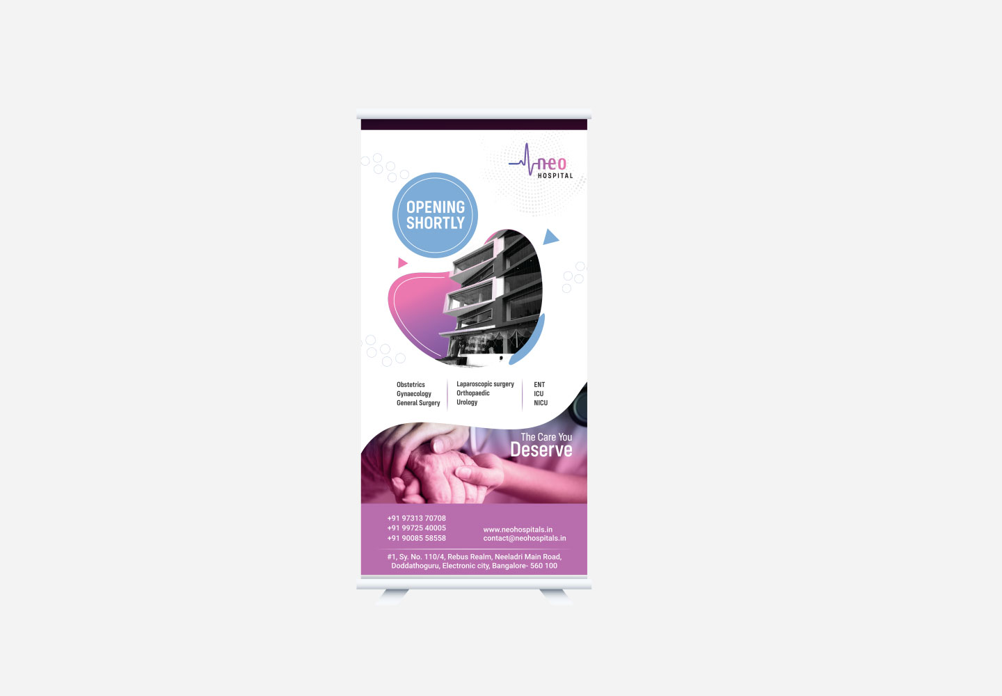
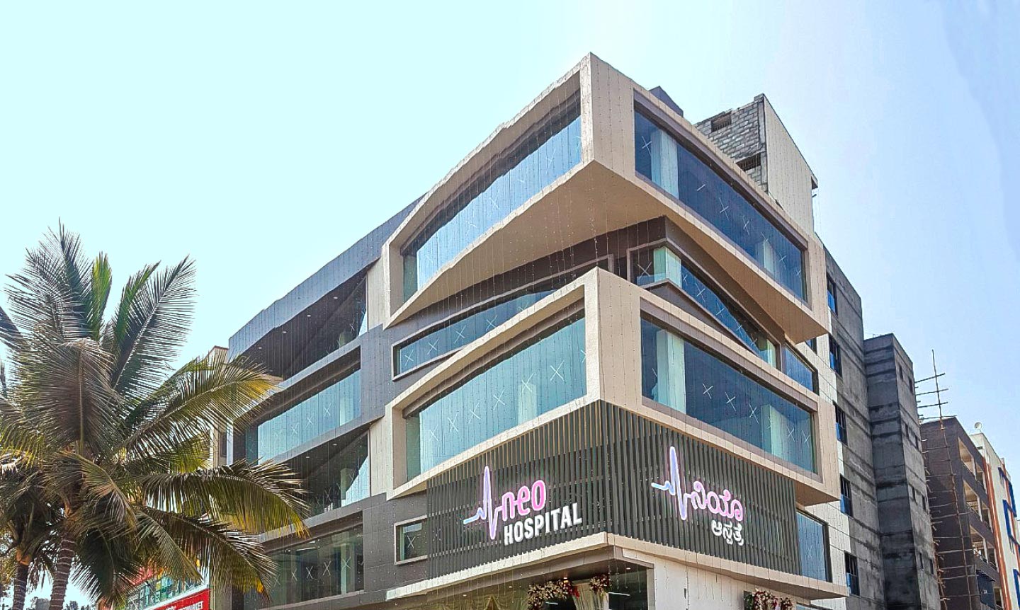
Evolving from Clinic to a new age multi-speciality hospital in Electronic City, Bangalore, we built the brand of Neo Hospital by embodying modernity and simplicity. Working closely with the very design of the infrastructure, the identity had to reflect positive healing care while being trustworthy & approachable.
In an industry that follows simple norms of unamusing designs and themes, we tackled those challenges by building a unique, modern appearance for Neo.
Industry
Hospital , Health care
Brand Identity
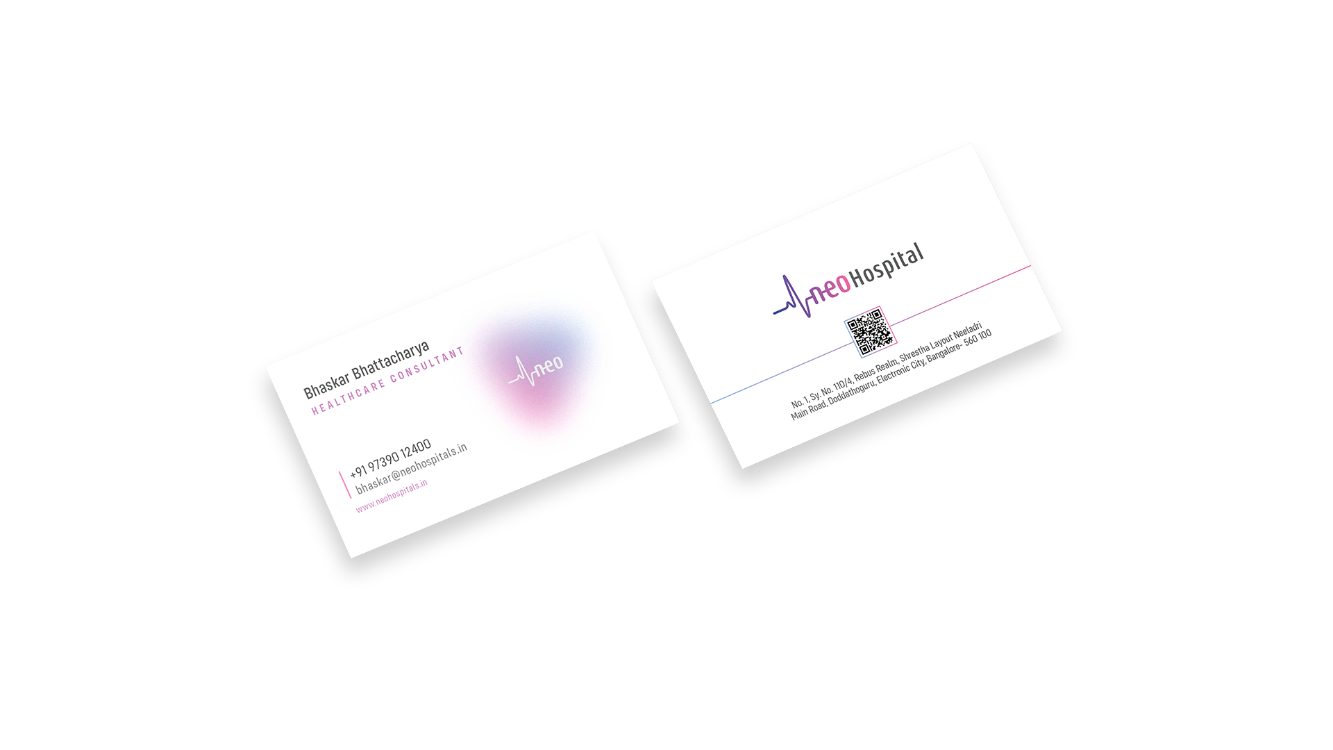
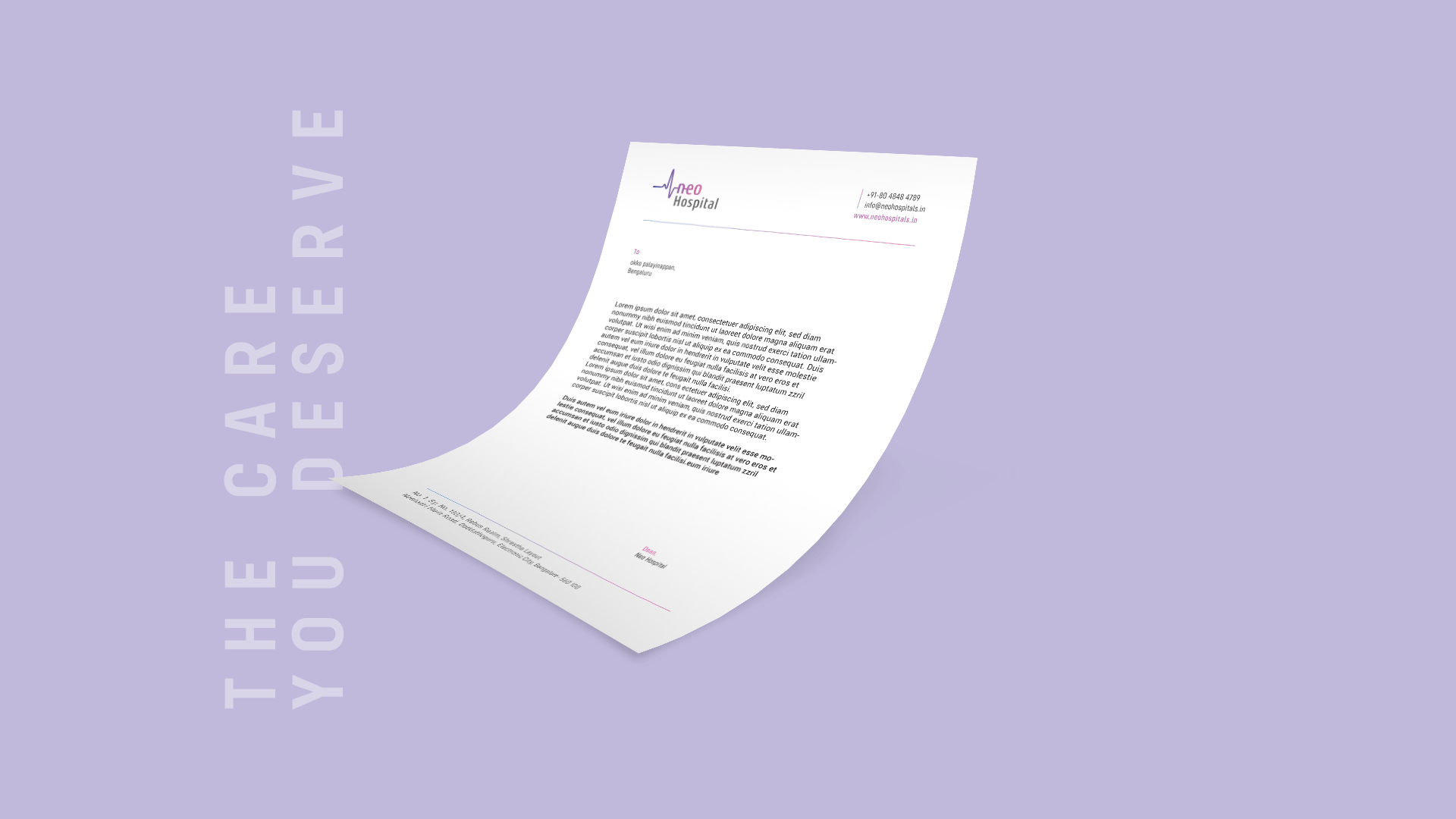
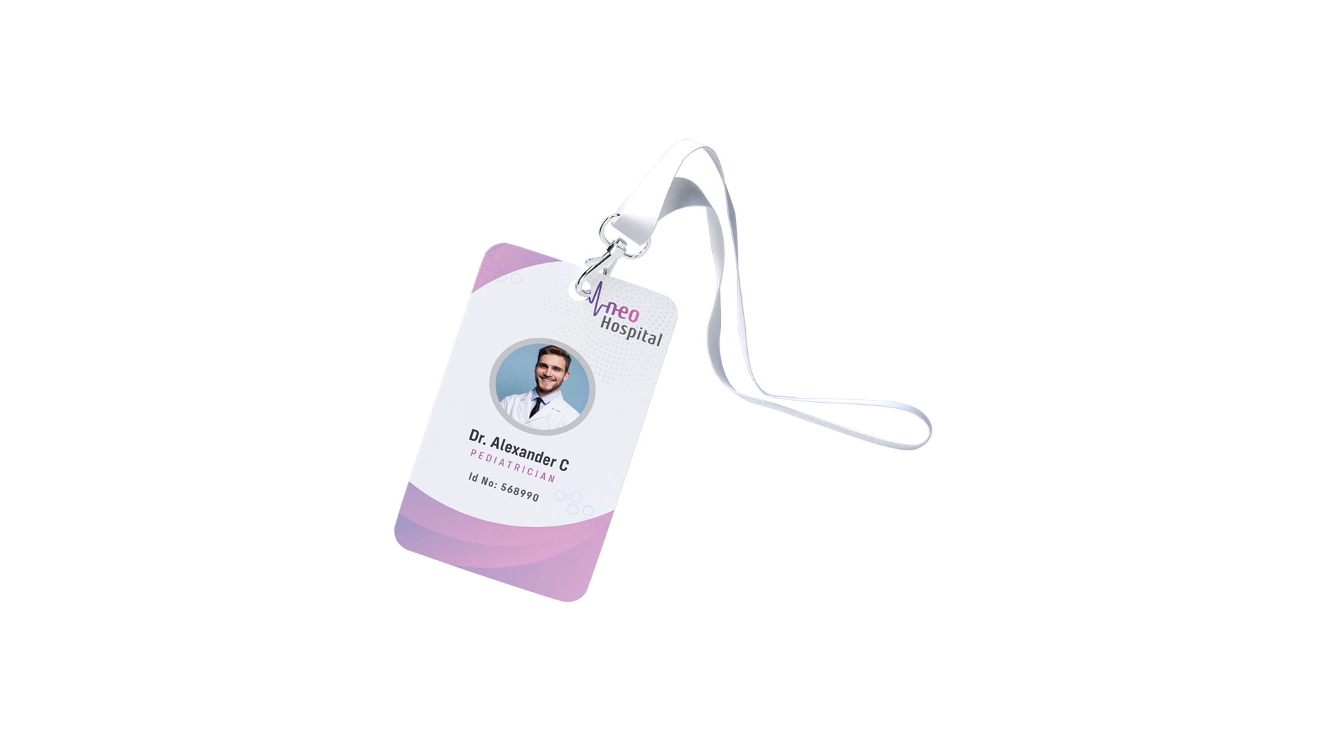
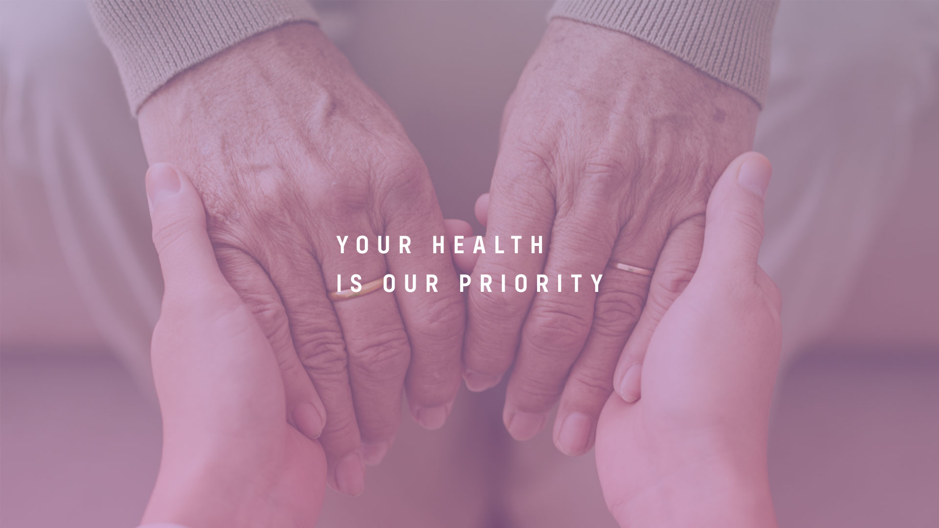
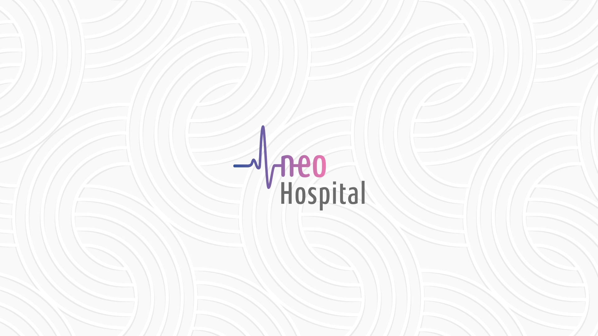
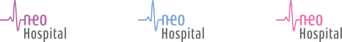
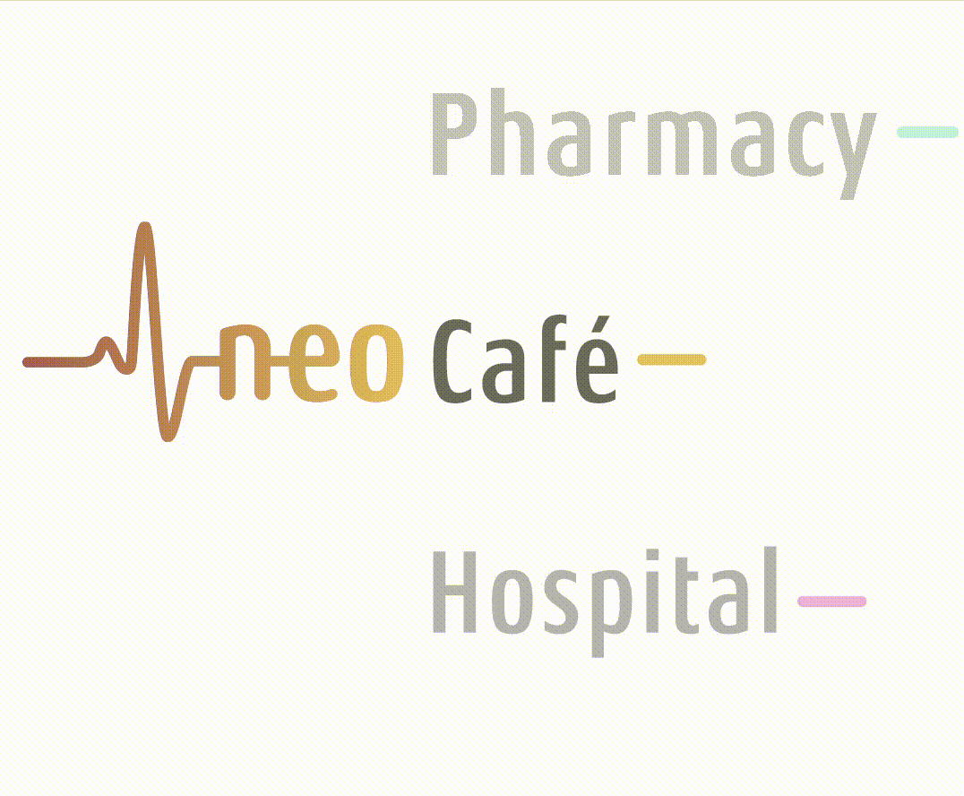
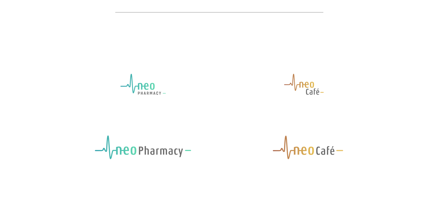
After consultation with their team, we further conceptualised the logo, including an ECG of a healthy heartbeat. The professionalism of Neo came via the legibility of the clean, smooth typography. The visual identity and soft gradients represent gentle care, compassion and affection. We also designed other facilities within the hospital (Pharmacy, Café, ID badges, Letterheads) in the same brand language.
Brand Identity Color variations
Brand variations
Brand Colors

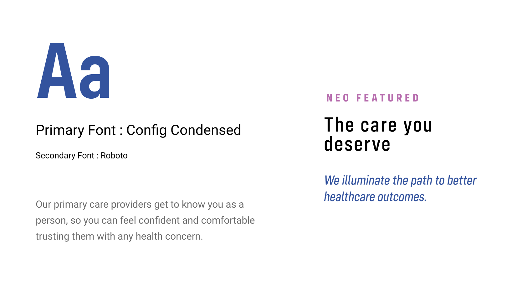
Brand Typeface
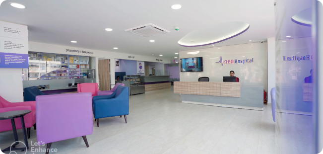
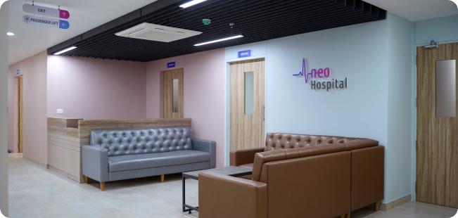
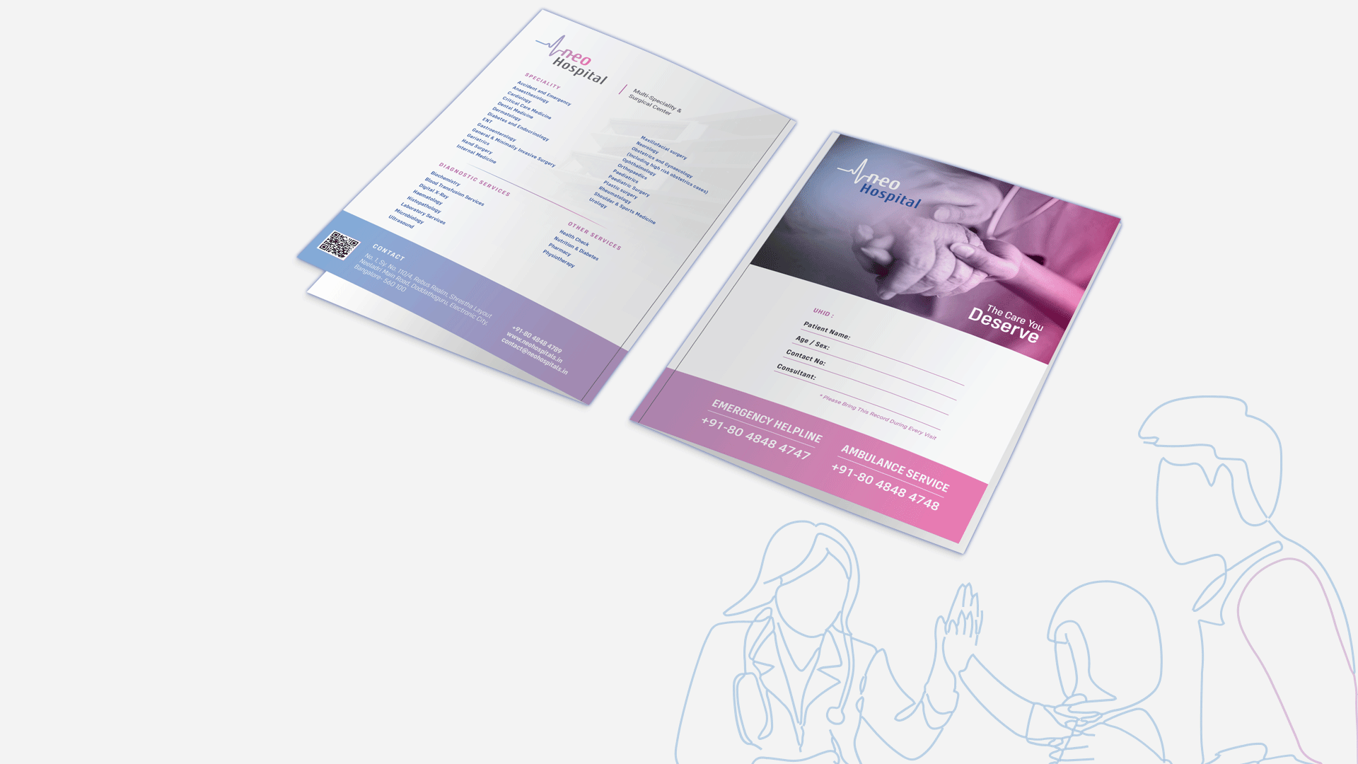
The next part of this journey with Neo led us to also design all their brand touch points with our creatives. Further exploring the soft gradients; the compassionate and modern presence was spread across the board. Business cards, Tag & Badges, (ID Cards) Directories, Folders, Wall graphics, Signages, Letter head and Envelops were all designed with our soft, contemporary tone and theme in mind.